Usability Testing of a Scheduling Flow
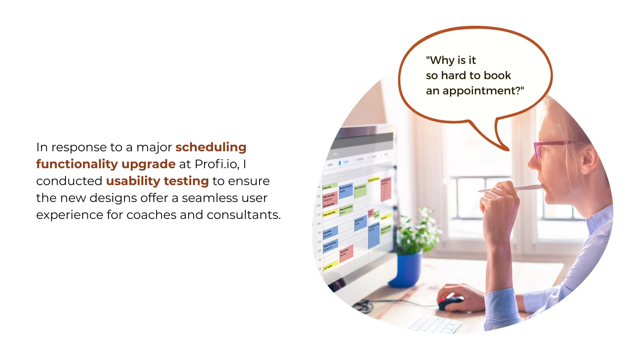
Scheduling is the backbone of Profi.io's service delivery platform for coaches and consultants. A major upgrade to the scheduling feature was planned — and needed validation before a single line of code was written.
Research Impact
Usability testing of the scheduling flow prevented a costly product failure. By catching three critical usability issues before development began, we avoided shipping a broken upgrade to our core feature that 1,500 active users depended on daily.
Critical Issues Caught Pre-Development
Three showstopping usability problems were identified and fixed before a single line of code was written for the new scheduling flow.
Engineering Rework Avoided
Issues were caught in the design phase rather than post-launch, saving an estimated three weeks of engineering rework and re-testing.
Users Protected from Disruption
A seamless transition to the upgraded scheduling experience prevented frustration and potential churn across the active user base.
Changes in Designs
Recurrence Settings
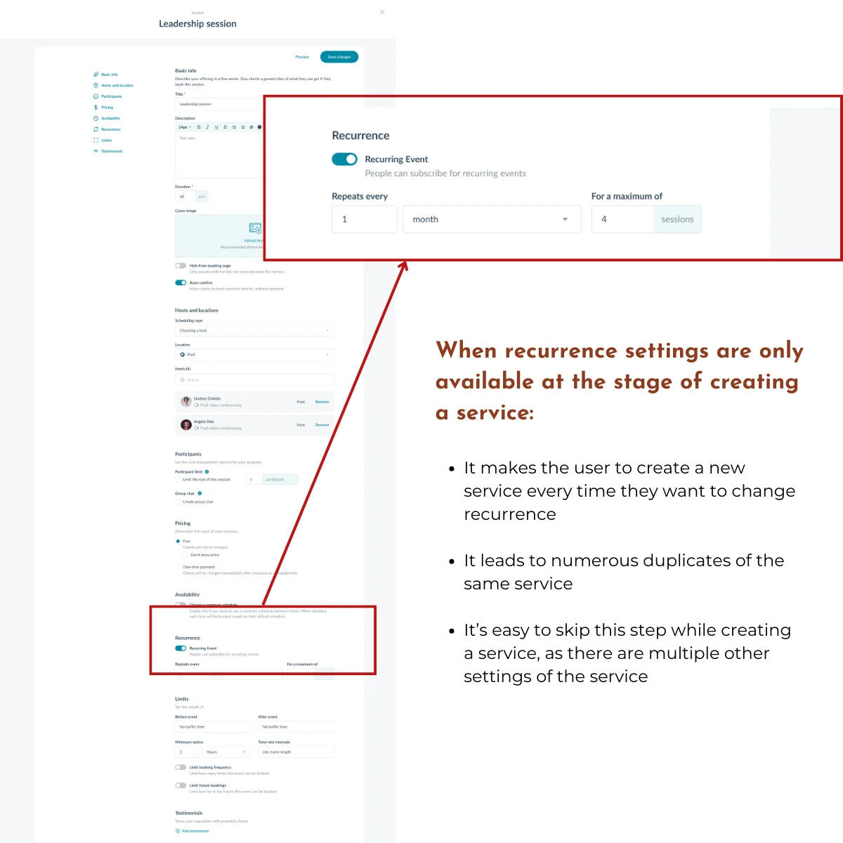
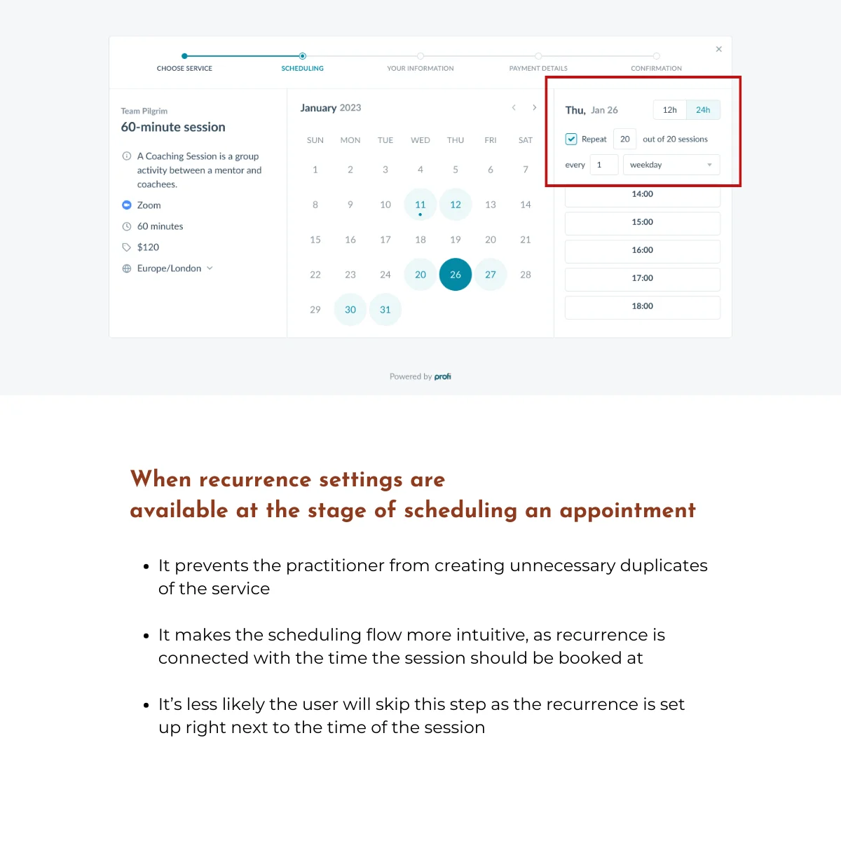
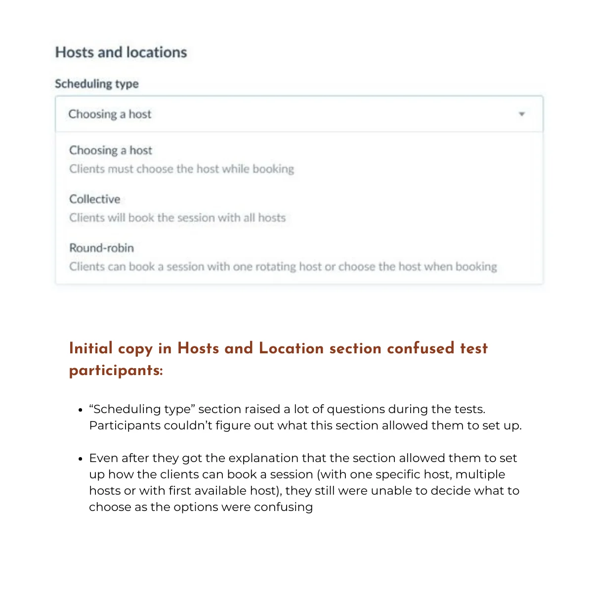
The "Scheduling type" section lacked recurrence options during appointment booking. Users had to create new services or faced setting confusion when trying to configure recurring appointments.
Recurrence settings are now available at the stage of scheduling an appointment, preventing duplicate services and improving overall intuitiveness.
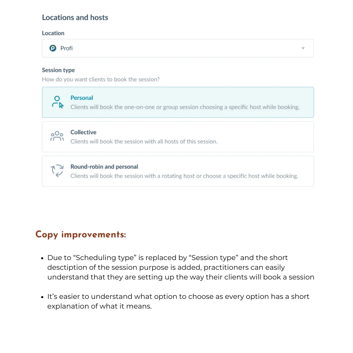
Confusing Copy
The term "Scheduling type" confused participants about booking options — single host, multiple hosts, or first available — making it unclear what they were selecting and for whom.
Renamed to "Session type" with a clear subheading and descriptive explanations for each option, significantly improving clarity.
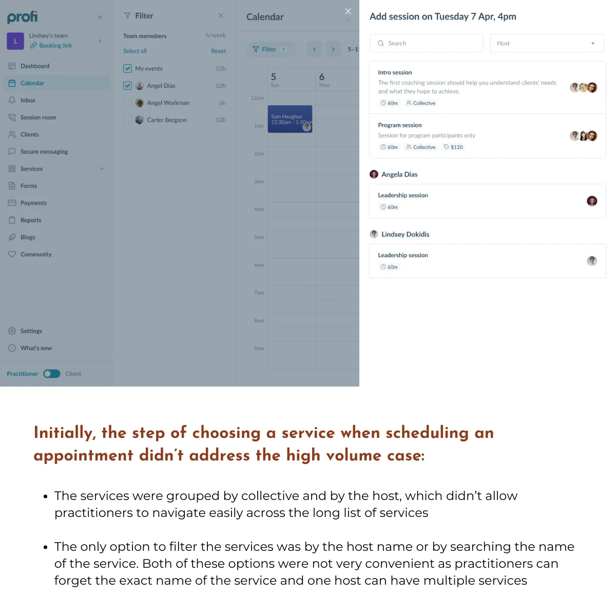
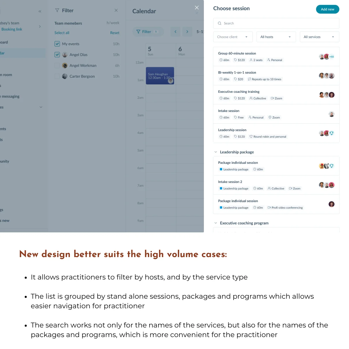
Service Selection Design
Over 50% of participants questioned the usability of the service list when managing a high volume of services. Grouping by collective or host was ineffective and hard to navigate.
Added filtering by host and service type (sessions, packages, programs) and improved search functionality to support scalability.
Research Process
Step 1: Define Research Goals
I partnered with the Product Manager and Product Designer early in the Scheduling Upgrade project to advocate for usability testing before development began. Together, we defined research goals and formulated key questions that would validate whether the new design would work for our 1,500 daily users. The team’s full support for this research proved critical. It became our safeguard against shipping a broken upgrade.
Research Goal: Evaluate the user experience of professionals in creating services and scheduling events using the new scheduling functionality.
Research Questions:
- How easy is it for professionals to create services and schedule events using the new calendar?
- What challenges emerge during the process?
- Are specific concerns validated: availability, scheduling types, recurrence, additional tooltips?
Step 2: Define Research Method
I designed the study as moderated usability testing sessions to capture the depth and flexibility this research required. The goals weren’t just “can users complete tasks?” — they were “where does the new design conflict with user expectations?” and “what mental models do users bring to scheduling?” Those questions demand conversation, not metrics.
What this enabled:
- Real-time probing when users hesitated or showed confusion
- Understanding of user mental models and expectations
- Flexibility to explore unexpected behaviors as they emerged
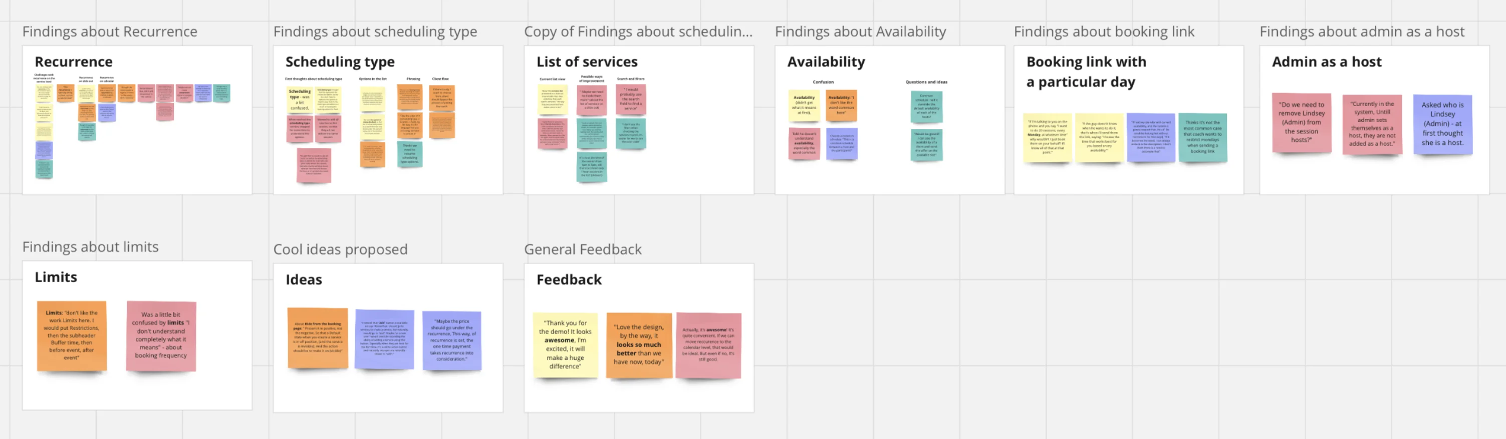
Analysis approach: I used thematic analysis across all sessions to identify recurring patterns and prioritize the most critical issues affecting user experience.
Step 3: Research Planning
I created a comprehensive research plan in Notion to ensure consistency across all sessions and enable smooth collaboration with stakeholders. The plan included everything from research goals and methodology to participant tracking and data collection templates — giving the team full visibility into the process and making it easy for Product and Design partners to observe sessions or review findings.
Key components:
- Research goals, questions, and methodology
- Usability testing protocol and script
- Participant recruitment criteria and tracking spreadsheet
- Task scenarios and prototype links
- Data collection templates and thematic analysis framework
- Deliverables timeline and stakeholder communication plan
Step 4: Participant Recruitment
I partnered closely with the Customer Success team to recruit participants who would provide authentic, high-value feedback. CS knew our customer base intimately: who had recently been interviewed, who represented different business models, and critically, which users were at risk of churn if this upgrade went poorly.
Together, we strategically selected participants based on:
- Avoiding research fatigue: Prioritized customers who hadn’t recently provided feedback
- Representing diversity: Included varying tech proficiency levels, business types, and demographics
- Mitigating risk: Included users interested in the upgrade and those showing early churn signals: if the new design worked for at-risk customers, we’d know we got it right
Collaboration in practice: CS facilitated all participant outreach via email, leveraging their existing relationships to boost response rates. Before each session, I met with the CS representative to discuss the participant’s history with Profi.io: any frustrations, recent support tickets, or context that would help me tailor my questioning while maintaining protocol consistency. This preparation ensured I could probe sensitively on pain points and understand feedback within each user’s unique journey.
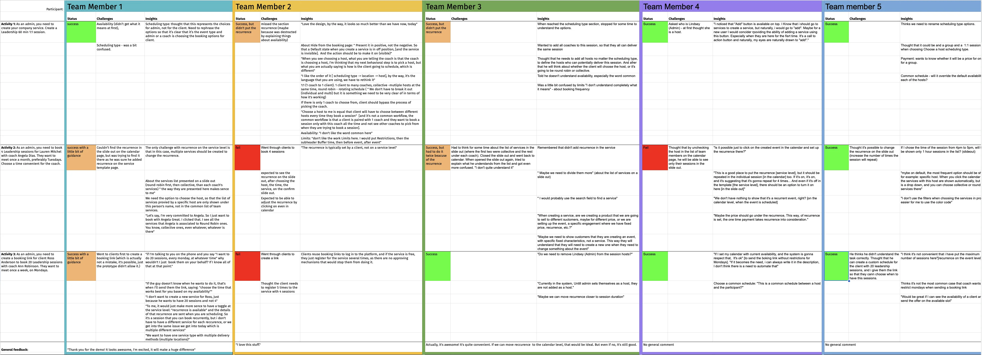
Step 5: Conducting the Sessions
Over 1 week, I conducted five moderated usability sessions via Zoom. Participants controlled the prototype remotely while thinking aloud, and I recorded sessions using Fathom AI to capture both verbal feedback and subtle behavioral cues.
What made these sessions effective:
- Cross-functional observation: The Product Manager attended all sessions, and I invited rotating stakeholders to each one. Watching users struggle in real-time creates empathy that no report can match.
- Iterative refinement: After each session, I led a 15-minute team debrief to discuss observations and reflect on what to adjust. By session three, I’d refined my probing technique around the recurrence settings based on patterns emerging across participants.
- Systematic documentation: I logged findings immediately after each session in a structured spreadsheet, capturing both explicit feedback and behavioral observations for later thematic analysis.
Step 6: Analyze the Data
With five sessions complete and detailed notes from each, I began thematic analysis to identify patterns that spanned individual observations.
My approach:
- Reviewed all session recordings and raw data notes
- Coded recurring issues, user pain points, and behavioral patterns
- Grouped codes into higher-level themes representing systemic design problems
- Validated themes by revisiting session recordings to ensure interpretation accuracy
This systematic approach ensured findings weren’t based on the loudest voices or most memorable moments — they reflected consistent patterns across our diverse participant pool.
Step 7: From Insights to Action
I led an interactive presentation with stakeholders and the product team, combining research synthesis with evidence that brought findings to life. Instead of just describing issues, I showed short video clips of users encountering each problem, letting the team see the confusion and frustration firsthand.
What made this presentation effective:
- Video evidence turned abstract findings into visceral moments (“Oh, that’s what you meant by ‘mental model mismatch’”)
- Interactive discussion prompted the team to contribute ideas for solutions in real-time
- Clear prioritization of the three critical issues that needed addressing before launch
The three critical issues were documented with supporting video clips and presented with clear severity ratings and recommended solutions. The designer began iterating on the recurrence settings that same afternoon. Within a week, all three issues had a revised design solution in progress. Engineering was briefed before the next sprint, and the updated prototype was ready for a second round of validation within two weeks — on schedule with the original development timeline.
Step 8: Validating Impact Post-Launch
After the design team implemented the recommended changes and engineering shipped the updated scheduling flow, my work wasn’t done. I used FullStory to monitor how users actually interacted with the new design in production, validating whether our fixes resolved the issues we’d identified in testing.
What I tracked:
- Task completion rates for creating recurring appointments (the flow that caused the most confusion in testing)
- Drop-off points and user hesitation patterns
- Support ticket volume related to scheduling